You’re scrolling through your newsfeed, bombarded with headlines screaming about a new study linking coffee to cancer. Panicked, you ditch your morning latte, only to discover a week later that the research was based on a tiny group of overcaffeinated hamsters and has no bearing on human health.
Welcome to the wild world of statistics in the media, where numbers are often twisted and turned like pretzels to fit sensational narratives. While statistics are powerful tools for understanding the world around us, they can become weapons of mass misinformation in the wrong hands.
This blog is your shield against the spin doctors of data. We’ll equip you with the tools to dissect misleading statistics in the media, expose cherry-picked data, and unmask the hidden agendas lurking behind flashy charts and graphs. Join us as we delve into the murky waters of statistical manipulation, uncover the common tricks used to distort the truth, and empower you to become a critical consumer of information in the age of data overload.
Misusing Numbers: Decoding the Spin in Media Statistics

Statistics are the backbone of informed decision-making, but in the hands of the media, they can morph into manipulation tools. From cherry-picked data to misleading visuals, dissect the most common statistical blunders plaguing news headlines and social media feeds.
Cherry-Picking Data
Imagine a fruit salad where you only find the juiciest, ripest strawberries. Sounds delicious, right? But what if that’s all you see, neglecting the less appealing but equally nutritious grapes and bananas? That’s cherry-picking data – presenting only the information that supports a specific narrative while ignoring contradictory evidence.

Media outlets often fall prey to this temptation, highlighting studies with eye-catching results confirming their biases. Remember that headline screaming about the dangers of chocolate? It might conveniently forget to mention the study’s small sample size or participants eating chocolate-coated furniture.
Misleading Visualisations
A picture is worth a thousand words, but a poorly crafted graph can tell a thousand lies. Enter the realm of misleading visualisations, where charts and graphs are contorted to exaggerate trends, obscure essential details, or simply look flashy.
Have you ever seen a bar chart where the vertical axis starts in the middle, making minor differences appear dramatic? Or a pie chart with confusingly similar slice colours, hindering comparisons? These are just a few tricks in the visual deception handbook, designed to sway your opinion before you even have a chance to analyse the data.
Small Sample Sizes
Imagine basing your life-changing decision on the advice of a single friend. Sounds risky, right? The same applies to statistics. Concluding studies with small sample sizes is like tossing a coin once and declaring it the new national currency.
Just because a study found a link between listening to polka music and increased hair growth in three volunteers doesn’t mean you should ditch your headphones for an accordion solo. Be wary of statistics based on tiny groups, as they might not represent the broader population and can lead to unreliable conclusions.
Correlation vs. Causation
Just because two things happen together doesn’t mean one causes the other. Remember the age-old adage about ice cream sales and drowning rates? While they both peak in summer, the ice cream isn’t pushing people into the pool!
Confusing correlation with causation is a standard statistical blunder, leading to headlines like “Coffee Linked to Lower Divorce Rates” or “Texting While Walking Makes You Smarter.” Before jumping to conclusions, remember that correlation doesn’t imply causation and other factors might be at play.
Ignoring Confounding Variables
Imagine attributing your exam success to your lucky socks, neglecting the months of studying and preparation. That’s what happens when we ignore confounding variables – factors that influence the results but aren’t directly studied.
These hidden influences can skew the data in research, leading to misleading conclusions. For example, a study linking exercise to increased income might neglect factors like education level or job opportunities that also play a role. Consider the bigger picture and look for potential confounding variables before accepting statistics at face value.
Become a Statistically Savvy Citizen
Navigating the media landscape requires a healthy dose of scepticism and critical thinking. By understanding these common statistical misuses, you can become a more informed consumer of information, able to spot red flags and question the claims that bombard you daily. Statistics are powerful tools, but like any tool, they can be used for good or ill. Be the one who wields them wisely.
So, the next time you encounter a statistic that seems too good (or bad) to be accurate, take a breath, dig deeper, and remember the lessons learned here. With some scepticism and a dash of statistical savvy, you can confidently navigate the world of information, leaving the spin doctors of data in the dust.
Case Studies: Exposing the Misuse of Statistics in the Media
These expanded case studies delve deeper into the tactics used to mislead, the potential consequences, and valuable takeaways for responsible information consumption. Remember, staying informed requires critical thinking, scepticism, and a healthy dose of curiosity to peel back the layers of statistical manipulations and uncover the truth behind the headlines.
1. The Case of the Coffee Crisis
Headlines blared: “Coffee Linked to Increased Heart Attacks in New Study!” Panicked coffee lovers across the globe clutched their mugs, their morning ritual suddenly thrown into doubt. But a closer look at the study revealed a classic case of cherry-picking data. Researchers solely focused on a small group of individuals with pre-existing cardiovascular conditions who consumed excessive amounts of coffee daily, neglecting data from the vast majority of coffee drinkers who experienced no such risks. This selective use of data created a misleading narrative, causing unnecessary anxiety without considering the bigger picture.
The Impact: Panicked coffee lovers abandoned their morning ritual, facing potential withdrawal symptoms and unnecessary anxiety.
The Takeaway: Don’t ditch your latte based on cherry-picked headlines. Look for well-designed studies with large, diverse samples and consider all contributing factors before making drastic changes based on isolated findings.
2. The Chart-o-Matic Catastrophe
A viral social media post depicted a bar graph showcasing a dramatic rise in violent crime rates over the past decade. However, upon closer inspection, the misleading visuals became apparent. The vertical axis started in the middle, exaggerating the increase by manipulating the scale. Additionally, the post failed to provide context, such as population growth or changes in reporting procedures, which could have significantly influenced the data. This case highlights the power of visuals to skew perception and the importance of questioning the presentation of statistics, not just the numbers themselves.
The Impact: Public fear and distrust in safety escalated, potentially leading to discriminatory attitudes and unnecessary security measures.
The Takeaway: Be wary of flashy visuals without context. Look for complete data sets, comparisons, and information about how the data was collected and presented. Remember, a well-crafted chart can tell a story but not always the truth.
3. The Smartphone Saga
Remember the news reports claiming that smartphone use leads to a significant drop in IQ? This case involved the fallacy of correlation vs. causation. While the study found a correlation between increased smartphone use and lower IQ scores in teenagers, it failed to consider other factors that could explain this phenomenon, such as socioeconomic background, family environment, or pre-existing learning difficulties. Attributing the cause solely to smartphones without accounting for potential confounding variables led to inaccurate and misleading conclusions, creating unnecessary panic among parents and educators.
The Impact: Unnecessary guilt and panic among parents, potentially leading to extreme restrictions on children’s technology use.
The Takeaway: Don’t blame smartphones for everything. Look for studies that account for confounding variables, explore alternative explanations, and remember that correlation doesn’t equal causation. A balanced approach to technology use, with healthy boundaries and mindful engagement, is critical.
These three case studies showcase a few common ways statistics can be misused in the media. By understanding these tactics and remaining vigilant, we can become more critical consumers of information and avoid falling prey to sensationalised headlines and manipulated data. Remember, questioning, digging more deeply, and seeking out context is crucial to navigating the often-murky world of statistics in the media landscape.
Unmasking the Spin Doctors: Your Guide to Spotting Misused Statistics
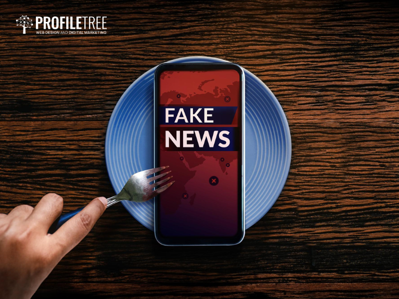
Welcome, fellow data detectives! We’re about to embark on a thrilling journey through the murky world of statistics, where numbers dance and charts sing… sometimes not always to the tune of truth. Fear not, intrepid truth-seekers, for I am your guide, and together, we’ll equip ourselves with the tools to spot statistical shenanigans and expose the spin doctors of data.
So, buckle up, grab your scepticism hat, and prepare to sharpen your critical thinking skills. We’re about to dive deep into the seven cardinal sins of statistical misuse, learn how to decipher the hidden agendas behind flashy graphs, and emerge victorious, armed with the knowledge to navigate the information landscape with confidence and discernment.
The Hype Hunters
Headlines screaming “Study: Chocolate Cures Cancer!” or “Social Media Causes Mass Extinctions!” are designed to hook you with shock value, not inform you. Ask yourself:
- Does it sound outrageous? If it seems too good or bad to be true, it probably is. Dig deeper for the full story before getting swept away by sensational claims.
- Who’s behind the hype? Check the source. Is it a reputable media outlet or a clickbait factory? Look for studies published in peer-reviewed journals or conducted by accredited institutions.
The Sample Size Sham
Imagine judging a whole cake by tasting a single crumb. Small sample sizes in studies can lead to misleading results. Be on the lookout for the following:
- Numbers less than a hundred: Small samples often don’t represent the larger population, making their conclusions unreliable.
- Isolating subgroups: Studies focusing on small, specific groups (e.g., only athletes or vegan seniors) may not apply to the general population. Look for studies with diverse and representative samples.
The Methodical Maze
A study’s methodology is like the map of its findings. Be a curious cartographer:
- Ask: how was the data collected? Were surveys, randomised experiments, or observational methods used? Each method has its strengths and weaknesses.
- Look for potential bias: Were participants pre-selected based on specific criteria? Did an organisation with vested interests fund the study? Bias can skew results.
The Missing Context Puzzle
A single statistic is like a puzzle piece – alone, it means little. Find the bigger picture:
- What are the limitations of the study? Every study has them. Acknowledge the caveats before drawing sweeping conclusions.
- Consider alternative explanations: Are there other factors that could explain the results? Don’t jump to conclusions based on one isolated statistic.
The Fallacy Fighters
Statistical fallacies are the hidden weapons of misinformation. Equip yourself to recognise them:
- Cherry-picking data: Presenting only evidence that supports a specific conclusion while ignoring contrary findings.
- Correlation vs. causation: Just because two things happen together doesn’t mean one causes the other. Don’t fall for this classic trap.
- Confusing absolute vs. relative risk: A slight total risk increase can sound alarming when presented as a relative percentage. Ask for both to get a clearer picture.
Question Everything!
Don’t be afraid to challenge what you read. Be your data detective:
- Ask experts: If something seems fishy, contact statisticians, scientists, or journalists for their insights.
- Cross-check information: Compare statistics from different sources to see if they align. A consistent narrative is more likely to be reliable.
Embrace Your Inner Skeptic
A dose of healthy scepticism is your best defence against being misled. Remember:
- Statistics are powerful tools, but they can be misused. Approach them with a critical eye.
- Always ask questions, seek context, and verify information. Don’t let statistics spin you around in circles.
Following these tips, you can transform from a passive reader to an active information detective. Become the master of your data destiny, unmask the spin doctors, and navigate the world of statistics with confidence and critical thinking.
From Stats to Savvy Citizens
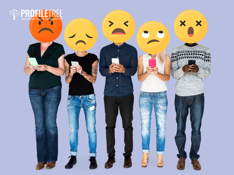
We’ve navigated the labyrinth of statistical misuse, armed ourselves with the tools to pierce through the veil of misinformation, and emerged a little wiser, warier, and hopefully, more sceptical. Remember, numbers don’t lie, but the people presenting them sometimes do. But by exercising our critical thinking muscles, questioning seemingly sensational stats, and seeking context rather than sensational headlines, we can become vigilant guardians of truth in the information age.
So, step out of the echo chamber of curated facts and dive into the diverse data pool equipped with your newfound scepticism. Don’t be afraid to question, dig deeper, and challenge the narratives presented as gospel. Remember, scepticism isn’t cynicism; it’s the gateway to informed understanding.
This journey through the statistics minefield hasn’t been about erasing the value of these powerful tools. On the contrary, it’s about appreciating their true potential when used ethically and responsibly. By understanding the tricks of the trade, we can safeguard ourselves from manipulation and become advocates for data literacy, empowering others to become critical information consumers.
Let’s leave the manipulation to the magicians, the misdirection to the fortune tellers, and the cherry-picking to the fruit salad makers. As savvy data citizens, we’ll stick to the facts, the context, and the quest for truth, one statistic at a time. Remember, the power to decipher the data landscape lies within each of us. So, go forth, fellow truth-seekers, and wield your scepticism like a sword, slicing through the fog of misinformation and illuminating the path towards a more informed and empowered world.
This is not the end of the road but the beginning of a lifelong journey of critical data consumption. Keep your eyes peeled for red flags, your mind open to nuance, and your voice ready to challenge misleading narratives. Together, we can turn the tide against misinformation and usher in an era of data-driven understanding and decision-making. Now, go forth and conquer the statistics jungle! Remember, knowledge is power, and scepticism is your compass.
FAQs
Why do media outlets sometimes misuse statistics?
There can be several reasons: 1. Grabbing attention with shocking headlines and dramatic numbers can drive clicks and viewership, even if it sacrifices accuracy. 2. Media outlets might present statistics that support their pre-existing agendas or cater to their target audience’s beliefs. 3. Journalists may not have the statistical literacy to interpret and report on research findings properly. 4. Sometimes, statistics are manipulated to promote specific products or agendas of advertisers or sponsors.
Is there a difference between misuse and misinterpretation of statistics?
Yes, there is a subtle difference. Misuse is intentionally manipulating data or presenting it misleadingly to deceive or push an agenda. Misinterpretation is an honest misunderstanding of the data due to lack of context, flawed methodology, or oversimplification.
How can I stay informed about the latest tactics of statistical misuse?
Fact-checking websites, journalism organisations, and data literacy resources are your friends in this quest for truth. Equip yourself with critical thinking skills and the tools to question, compare, and cross-check information. Remember, knowledge is power, and information literacy is your superpower. By embracing your inner detective, you can navigate the media landscape with a discerning eye, separating the nuggets of truth from the glittering mirages of misused statistics.
Are all statistics in the media bad?
Absolutely not! Statistics are powerful tools to understand trends, track progress, and inform decisions. The issue lies in their misuse, manipulation, or misinterpretation, distorting the truth they hold. Think of it like a recipe – even the finest ingredients can turn bitter with the wrong mix or cooking technique.
Can the future of statistics be brighter?
Absolutely! By cultivating data literacy, demanding transparency from media outlets, and promoting responsible research practices, we can collectively illuminate the path towards a data-driven future where statistics empower, not mislead. Join the quest for truth, fellow detectives, and together, let’s make the media landscape a beacon of accurate and responsible information.
